Crafting LISAN Counselling’s Brand Identity: Where Meaning Matters and Every Element Connects
From our early conversations, Lisa was clear: avoid the generic, spa-like aesthetic so common in counselling. She wanted warmth with forward momentum, and a touch of levity—Counselling as a launchpad toward lasting independence. That brief guided every design decision.
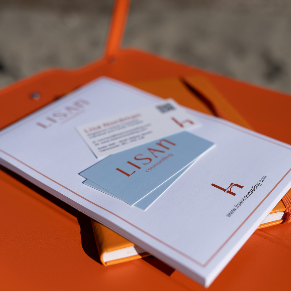
The name LISAN Counselling was proposed as a purposeful alternative: a name that feels personal without relying solely on the clinician’s name, and that gives the practice a distinct, memorable voice. Discovering “lisan” felt like serendipity. It operates on multiple levels: lisan (Arabic for “tongue”/“language”) honours the power of expression and storytelling; phonetically it echoes “listen,” centring attentive care; and read as “Lisa N.” it quietly references Lisa Nordman. To invite both readings, LISA is set in full caps with a small-cap n—an editorial typographic choice that seeded the visual system.
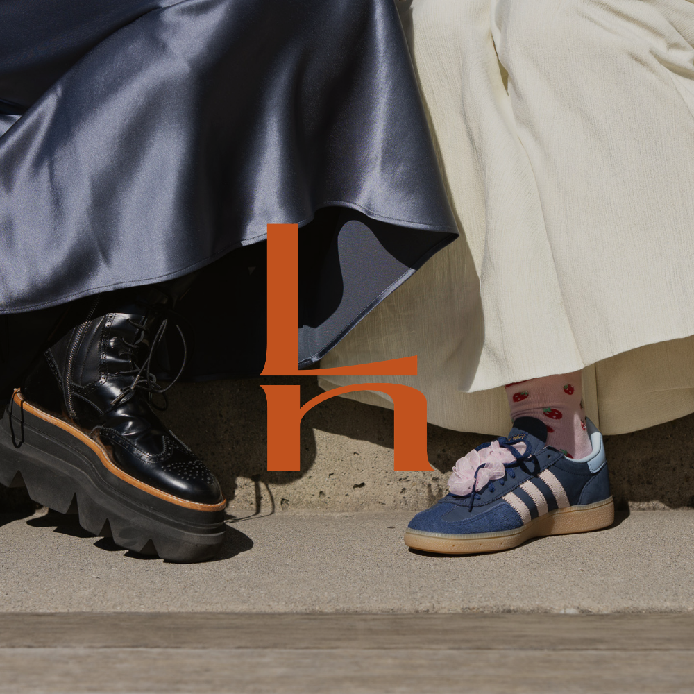
That typographic play yielded the brandmark: a stacked L + n suggesting a chair silhouette—a subtle emblem of the therapist’s seat, safety, and held presence. From that mark grew the tagline, “Let’s Sit Together,” and the idea to represent clients through shoes—a human, accessible device that illustrates individuality, journey, and the many people who come to sit with Lisa.
The outcome is a cohesive identity system where name, mark, tone, and narrative are deliberately aligned around a single promise: clear, compassionate care that feels intentionally, and inevitably, right.